Monday

Duct Tape and Sheets Make BIG Impact at a Small Cost

The booth at Paris on Ponce with Heather Means is taking off. Our upcycled Hollywood Glam meets Happy Chic product stands out from the other vendors. However, our booth design did not stand strong, nor match our vibrant product. So Heather and I had to put our thrifty thinking caps on and brainstorm ideas on giving the space a much needed face lift.

We want to provide an inviting environment so buyers will want to come into our booth/space. However, this must be done on a tight budget. After all, the goal is to maximize profit and minimize spending. We agreed the two main areas that make the most visual impact are the walls and the floor.

The Walls:
Other booths used burlap to cover their walls, and that just doesn’t fit with our style. However, purchasing yards of fabrics with prints/patterns is costly. So, I proposed using King or Queen size flat bed sheets since it comes in large sizes providing more coverage and prevents us from matching the pattern repeat several times.


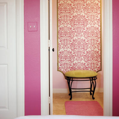
Of course this same concept can be used in homes, especially apartment or rental spaces where wallpapering is out of the question or out of the budget.


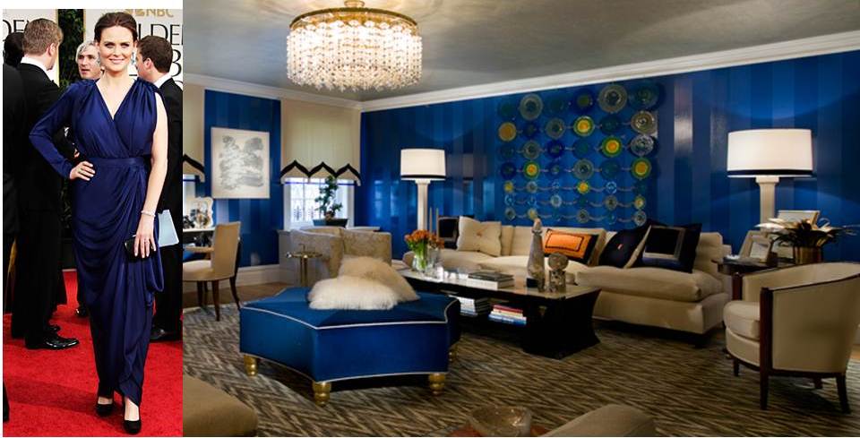
If you're not interested in covering an entire wall, framing options also make a large statement.


Click here for step by step instructions on HGTV's website for the various application methods to install fabric wall covering.

Because we used two different prints on the top and bottom of the side walls, we needed a border to hide the seam….decorative tape to the rescue!  This particular print is from Michael's, but there are several great options to choose from.


If a border isn't enough to tickle your fancy, try creating an entire wall installation using duct tape.

Love the random falling pieces of tape... it says effortless while still making a graphic statement.

The Floor:
We couldn’t stop the taping there….we took it to the floor using yellow duct tape to create a random/effortless chevron pattern. The much needed pop of color ccamouflaged the gray painted floors that screamed penitentiary and whispered Help! 


Because duct tape comes in just about every color under the sun, the possibilities are endless.Here are a few other amazing ideas using duct tape for the floors in interior spaces.


The thought of having to remove duct tape and its sticky residue  from my home floors is not appealing. However, applying duct tape to a rug is also an option to give the same eclectic affect.


I am very intrigued by this idea of reviving an existing rug. I am thinking of turning this into a DIY project for my breakfast nook that is in much need of a rug underneath the table....stay tuned for results.


2012 Color Trends Seen On Golden Globes Red Carpet

The red carpet fashion for last night’s Golden Globe Awards gave a sneak peak to this year’s Spring/Summer color trends.  The 69th annual took place in Beverly Hills and I was definitely inspired to see several stars step outside the ordinary box of black, white or red gowns.

According to the Pantone, the world-renowned authority on color, consumers look to Spring for renewed energy and optimism. Through surveying the designers of New York Fashion Week and worldwide to determine the season’s most important color trends, the palette identified for Spring/Summer is sure to start 2012 off on a strong cue.


The 2012 colors range from vivid brights, soft muted tones and classic fun-loving pastels to represent a range of styles and lifestyles.


Solar Power provides a jolt of energy and radiates warmth and cheer.


Cabaret is a sexy and sensual rosy-red. Not as vivid as Fuschia, but will still serve as a great alternative to red.


Sodalite Blue is a classic maritime hue that will work with any color in the palette.


Starfish is a warm natural hue that lends a sense of summer beach. The versatile neutral will complement all colors featured in the 2012 palette.

Cockatoo is a softer shade of the turquoisey, blue-green family, which makes me Happy Chic! This color is sure to add a touch of whimsical while making a strong statement.


Driftwood is the perfect combination of beige and gray and represents its name to the fullest.  Providing a slightly weathered feel, this adaptable neutral will work seamlessly with the 2012 vivacious colors.


Bellflower speaks royalty while maintaining a sense of playfulness and creativity.


Although the following three colors were not represented on the Golden Globes Red Carpet, they are still strong contenders in the 2012 Spring/Summer color trends and are sure to be spotted in the near future.
Margarita is a clean and fresh yellow-green.  Reminiscent of a nursery color choice representing blossoming and new life.

Sweet Lilac also functions as a timeless pastel. This delicate pinkish lilac adds a touch of romance.


Tangerine Tango is the Pantone Color of 2012. This alluring juicy orange is a vibrant pop of color to transform any space.

Pantone suggests several combinations of the Spring/Summer palette for an ultra-bold vibrant look in 2012.  Which ones will you mix and add to your palette?